Global CO2 emissions – The Facts and Science explained.

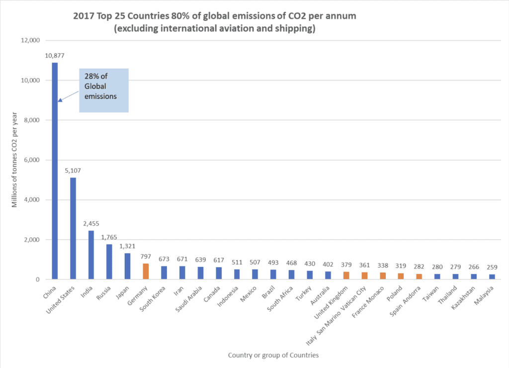
Firstly any Global Solution must include China and the United States as between them these two largely populated Countries account for 41% of the Worlds CO2 emissions. It is time for the United Nations to grow some teeth and put pressure on these two Nations to take matters seriously. All the other Nations efforts to go Zero Carbon over the next decades will be wasted, without drastic cuts from the ‘Big Two’ polluters.
How does the atmosphere CO2 level cause Global warming?
It is actually pretty straight forward Science. The short wave-length sunlight penetrates the atmosphere and shines down on the Earth’s surface and warms that surface. White or light-coloured things reflect the light (clouds, ice, snow) so reducing the warming effect, but dark coloured things warm up (soil, sea, green/brown space etc). Warm things emit long wave-length light (infra-red or IR) back up away from the surface, however CO2 molecules vibrate with IR and so block the energy escaping back into the cold of space.
So the more CO2 in the atmosphere the hotter the planet’s surface gets. This effect almost two centuries ago was called the Green House effect – hence the current term of Green House Gases (GHG) which is mainly CO2 but also six other gases defined under the Kyoto Protocol. Combining these gases together gives the expression CO2 equivalence or CO2e for short.
Just so you know, none of this is new Science. It started in 1824 with a man called Fourier who invented the words ‘Green House Effect’ and was more conclusively proven in 1896 by Arrhenius who demonstrated that human CO2 warms the planet. More recently in the 1950’s the USAF wanted to make heat-seeking missiles, so took the atmospheric CO2 effect into their designs and so by measurement proved beyond doubt what Arrhenius had demonstrated mathematically in 1896.
So how bad is it today? – What does the data show?
The daily and monthly CO2 atmospheric level can be viewed on the web by typing in the above observatory name. I have added a light blue line to show that CO2 has been increasing more every year since 1995 as the World population rises and fossil fuel energy consumption per head also rises. In 2019 we are at 410 parts per million, in 1960 circa 315 ppm – so a 30% rise in 59 years. There are in total four US owned observatories monitoring CO2, and the measurements are all similar. Barrow (Artic), Manua Loa, Hawaii, American Samoa and South Pole.
The Global Temperature Anomaly (Global Warming) can be seen by the blue line against the left axis – there are arguments about where zero is, but on this graph it is circa the 1940 to 1970 period. Between 1940 and 1970 there was a fluctuation up and down, but the general measured trend was seen as either flat or going down very slightly. However in stark contrast between 1970 and 2007 (~50 years) the blue line is going upward and it matches very well the red line which shows the increasing CO2 concentration. Scientifically the correlation of the two pieces of data is good over almost a fifty year period. This data matching between CO2 and temperature carries on in 2019 and it is expected to do so into the future.
Where is all the Carbon on the planet, and why does burning fossil fuels make the difference?

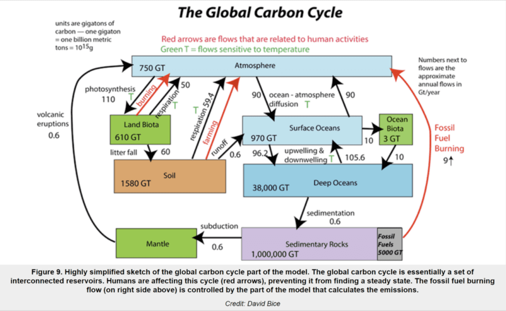
This complicated diagram, which the smart author David Bice calls ‘highly simplified’ gives a reasonably clear picture of what is going on. The red arrows are bad news, releasing Carbon into the atmosphere that just builds up the Carbon in the top light blue box labelled ‘Atmosphere’. If you study the diagram for a while, you can see that it is all in balance except for the 9 X 10⁹ tonnes (9Gt) of Carbon coming from fossil fuels. Take your time on this one, or just trust us our analysis.
You need to multiply the Carbon figure by 3.667 to get to CO2 – so when this diagram was drawn fossil fuel was emitting 33 Gt of CO2. By 2017 that had risen to 37 Gt CO2e. This emission rate equates to 5 tonnes CO2 per head per year for the 7+ billion Global population.
UK is currently at about 6 tonnes CO2 per head per year (excluding international travel), the US at 16 tonnes CO2 per head per year, with Qatar at 37 tonnes CO2 per head per year. The highest figure quoted is a shocking 65 tonnes CO2 per person per year.
This absolutely beautiful photograph was taken by astronauts on the international space station in 2011. It shows the Earth surface at the bottom in an almost black colour with the atmosphere in orange lower down and blue higher up. The moon hangs in mid picture to give scale. The Atmosphere is held to the Earth by Gravity and is deemed to be ~100km thick, but all (99.99%) of the gas is within 50km of the surface.
Time for some simple UPC Maths.
The Atmosphere is a constant volume and can be calculated – UPC make it 5.17 X 10¹⁹ cubic metres.
At 410 ppm of CO2 the CO2 volume is 2.1 X 10¹⁶ cubic metres.
We can convert this to Tonnes of CO2 in the atmosphere and then calculate the effect of adding 37Gt or more every year to this CO2 atmospheric mass.
Convert CO2 mass back to ppm and as we know the observed relationship between CO2 ppm and temperature – we can then predict very simply what temperature will be.
This is a simplified Engineering calculation, not a Scientific one, but it shows the Global trends very clearly.
The reader can decide if a 0% annual rise in emissions is likely over the next years, or whether it will stay at the 2% trend, or perhaps somewhere in between. It does however seem that we are headed for a 2 degree C rise.
So unless we can down scale the fossil fuel CO2 we are on an endless upward spiral of temperature rise. The UPC numbers show 2 degrees by 2040. The facts that we do know is that the less CO2 we produce the temperature will rise less or stabilise if we start reducing CO2 emissions. The UN RCP assumptions all model a future where radical reduction in CO2 emissions are achieved.
It needs us all to go on a World War footing against this global problem to fix it – and that is the bald truth. The human race is generating the change, and needs to sort it.
What can be done about your National CO2? What top 3 simple changes can you make?
#1 Reduce using single occupancy road cars for journeys.
- Car sharing helps radically to reduce CO2 emissions
- Keep your tyres pumped up, and drive smoothly with gentle acceleration
- Higher miles per gallon means less CO2 emitted from your car
#2 Replace your short haul jet airplane journeys (1000 km or less) by trains.
- Trains typically emit about a tenth of a short haul airplane per person km.
- Buses also emit less than an airplane per person km.
- An economic car with four passengers is much less polluting than an airplane.
#3 Improve the energy efficiency of your home.
- Stopping air leaks, double or triple glazing, insulation increases – help reduce CO2 whether you are trying to cool or heat.
- When using aircon add a few degrees to the setting temperature – save energy and thus reduce CO2.
- When using heating take off a few degrees from the setting temperature – save energy and thus reduce CO2. Put on more clothes if you are cold…
- Remember the lower your bills are the lower your personal CO2 is.
What do you think? Email us: technology@upccambridge.co.uk

